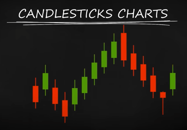
Candlestick chart consists of red and green “candlesticks”, or “candles” lined one after another.
Each candle gives you detailed information about the price movement within a specified time interval.
Japanese candlesticks are the best way to visualize the ups and downs of a price, so that you can spot potential opportunities to BUY or SELL. Let’s take a more detailed look.
The candle
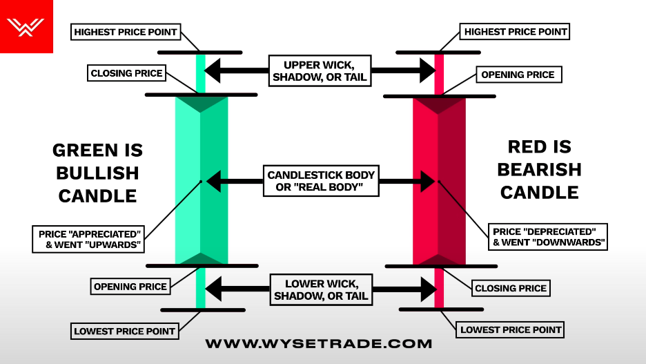
Every candle consists of a body and one or two “tails” called shadows sticking out of it.
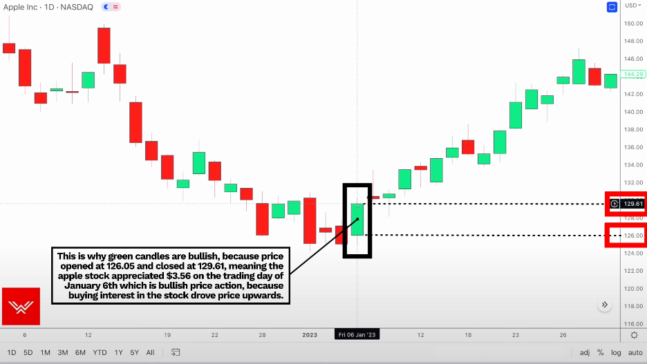
Green is bullish candle 🐮 (⬆️, opening price < closing price), Red is bearish candle 🐻 (⬇️, opening price > closing price)
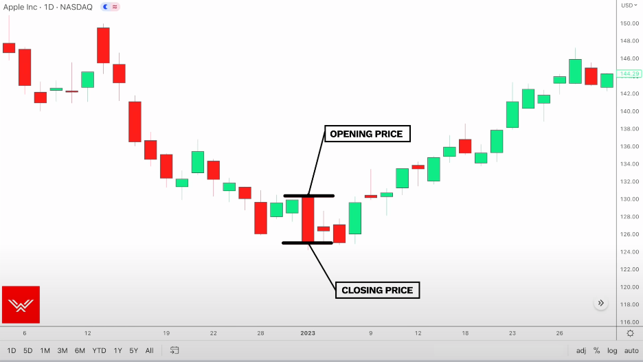
The body indicates the range between the open and close prices for a specific time frame
The shadows represent the highest and lowest price levels reached for the set interval.
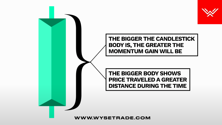
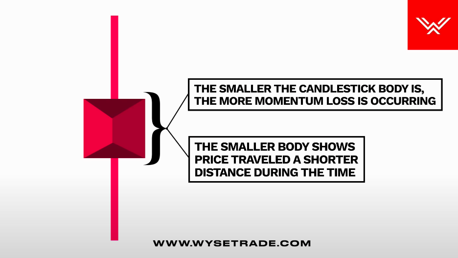
Body size
The bigger the Candlestick body, the more it represents momentum gain as price traveled a greater distance during that time period.
The smaller the Candlestick body, the more it represents momentum loss as price traveled a shorter distance during that time period
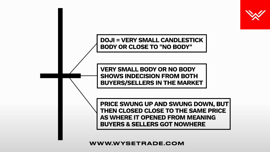
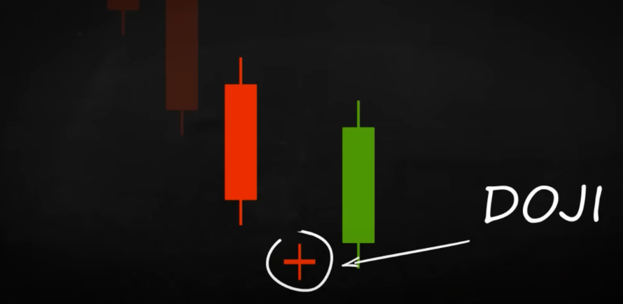
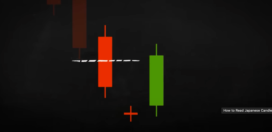
Doji: Very small candlestick body, or close to no body
Represents indecision from buyers and sellers, because price swung up and swung down during that time, but then closed close to the same price as where it opened, which means buyers and sellers got nowhere and, again,shows indecision.
Why are Candlesticks Important to Understand?
Candlesticks tell a story and are a reflection of what buyers and sellers are doing (mainly the large institutions),
The Candlestick pattern that forms at that particular moment in time tells you a lot about what is going on in terms of the buying and selling occurring in the market.
Traders will look at candlestick patterns and the movement of candlesticks to make trading decisions, which is also known as price action.
How to read the candlestick chart?
Example:
Basics
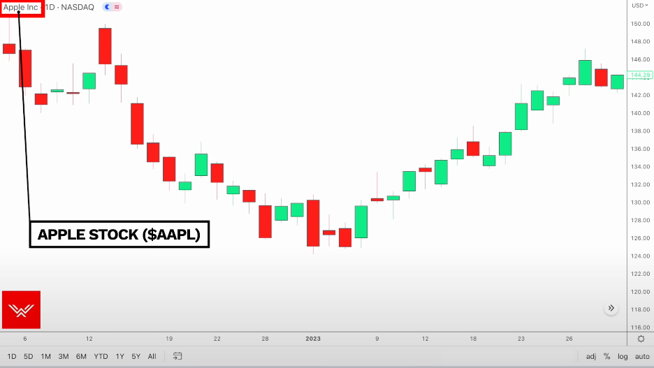
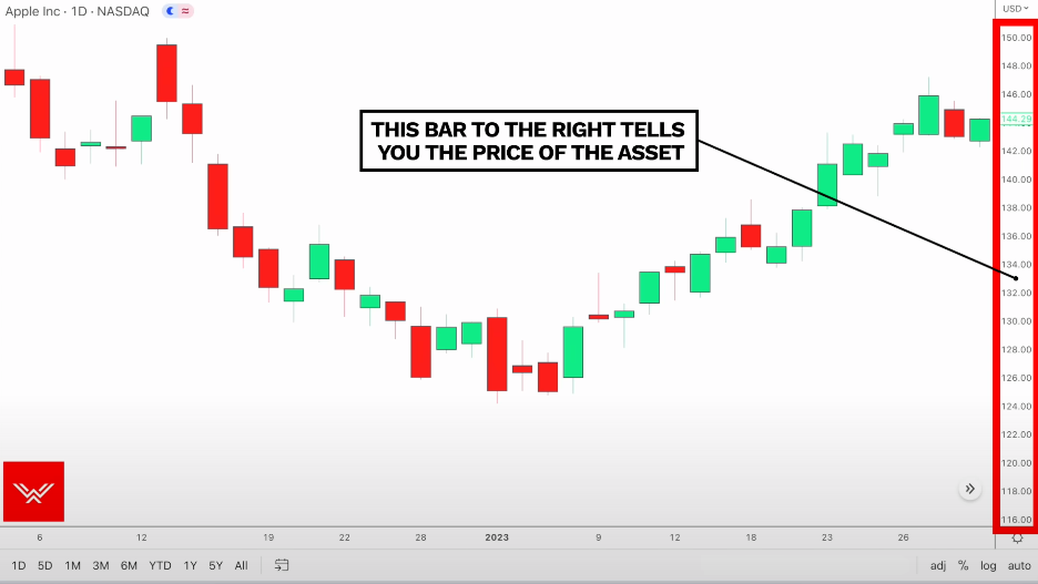
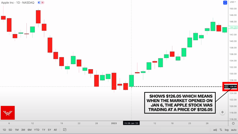
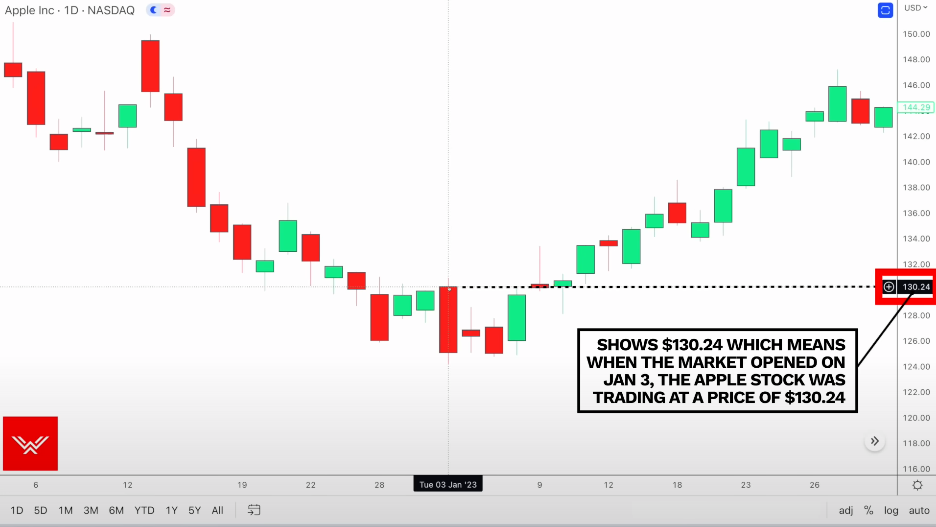
Apple Inc: The asset you are looking at
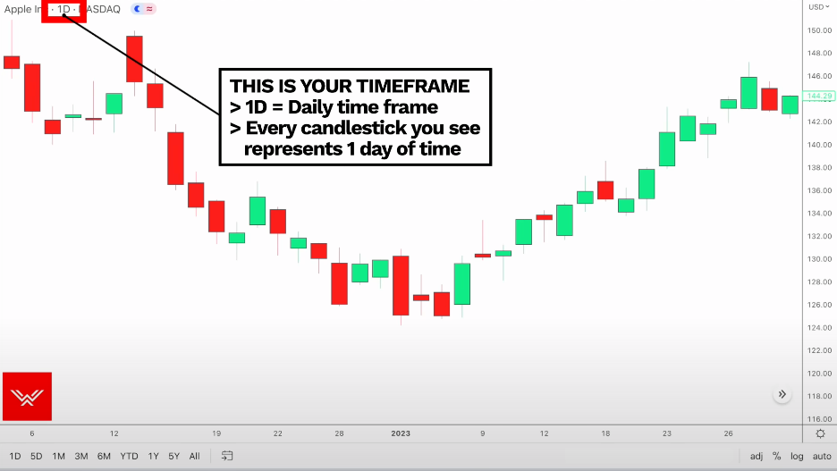
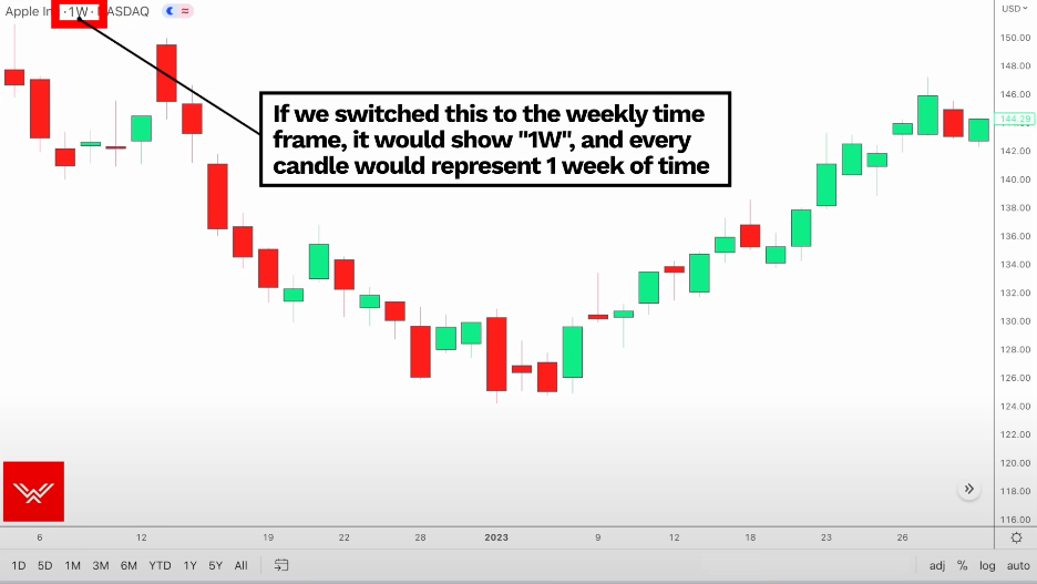
1D: The time frame. It shows 1D, meaning that every candlestick is representing one day of time.
If we switch this to the weekly time frame, it would show 1W, and then every candlestick you see on screen would represent one week of time.
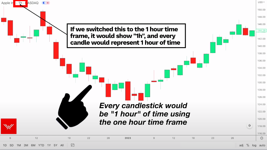
If we switch this to the one hour time frame, it would show 1H, and then every candlestick on screen would represent one hour of time.
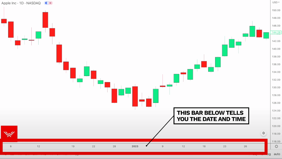
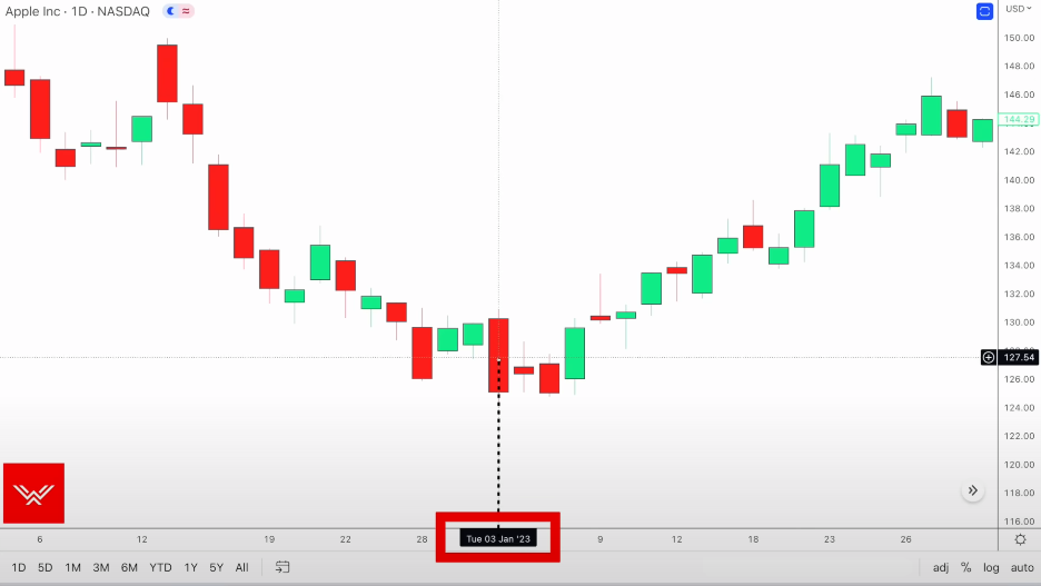
The x-axis tells you the date and time
The y-axis tell you the price of the asset.
Green candles are bullish
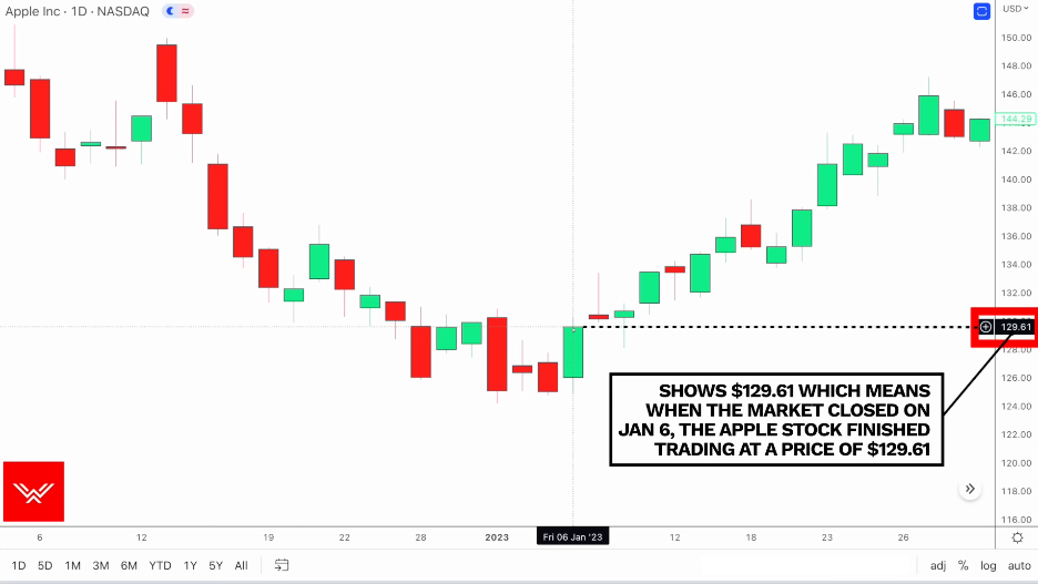
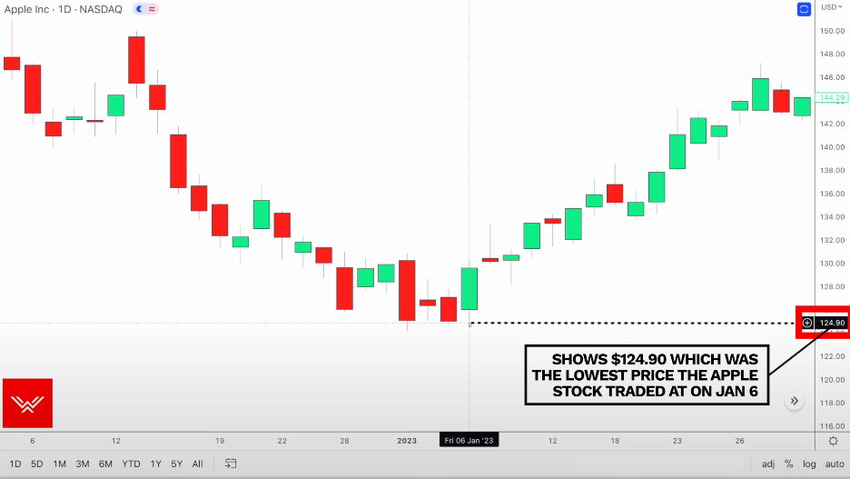
Price opened at $126.05$ and closed at $129.61, meaning the Apple stock appreciated $3.56 on the trading day of January 6, which is bullish price action because buying interest in the stock drove the price upwards.
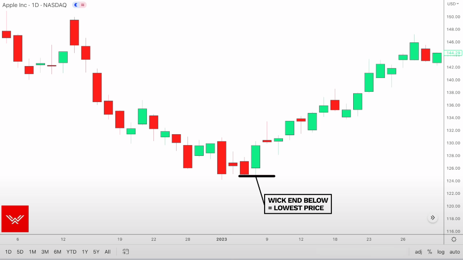
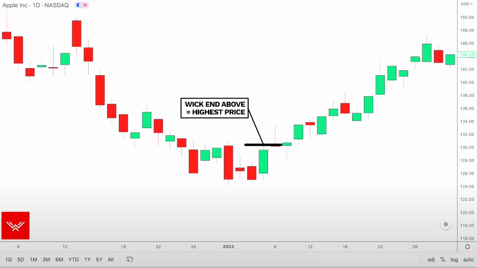
Wick
The wick below is the lowest price that the Apple stock reached that day
The wick above is the highest price that the Apple stock reached that day
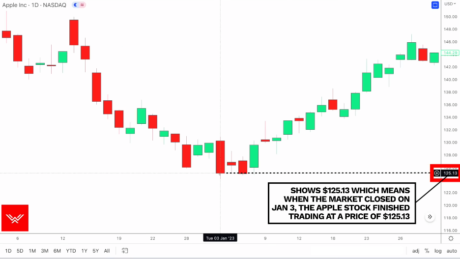
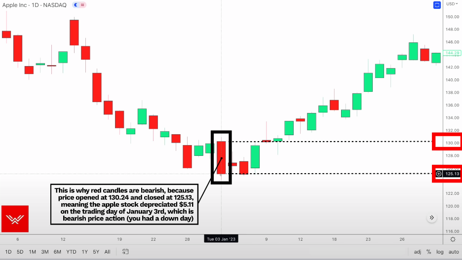
Red candles are bearish
Opening price:
Closing price:
Open < Close -> bearish price action 🐻
Trend
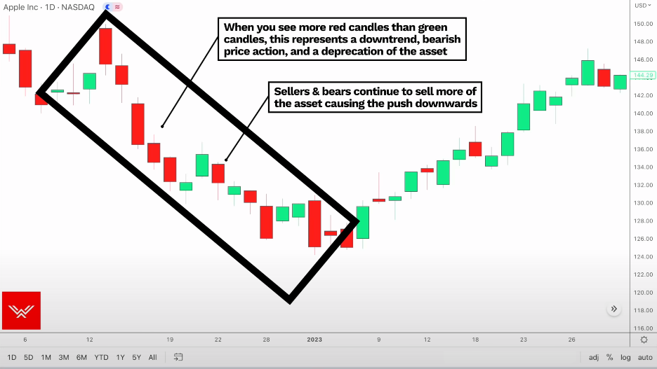
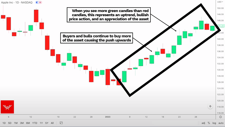
More bearish than green -> Downtrend and bearish price action ⬇️ (a depreciation of the asset as sellers and bears continue to sell more of the asset, causing the push downwards.)
More green than bearish -> Uptrend and bullish price action ⬆️ (an appreciation of the asset as buyers and bulls continue to buy more of the asset, causing the push upwards)
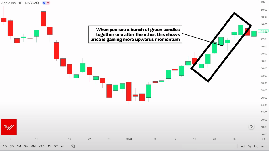
A bunch of green candles together, one after the other -> The price is gaining more upwards momentum
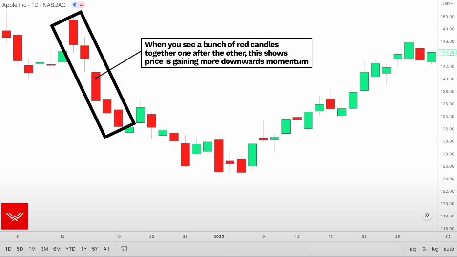
A bunch of red candles together, one after the other -> The price is gaining more downwards momentum
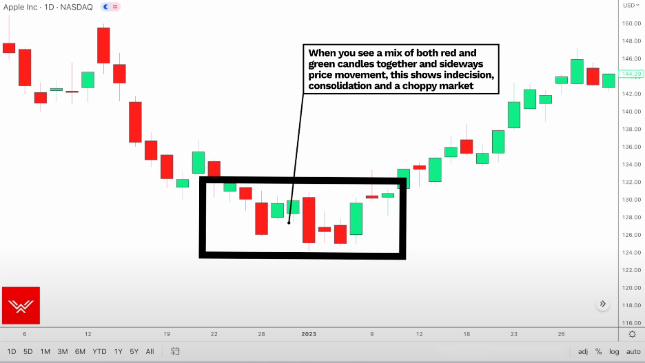
A mix of both red candles and green candles together with sideways price movement -> indecision and consolidation in a choppy market.
How to Identify Trend
Uptrend
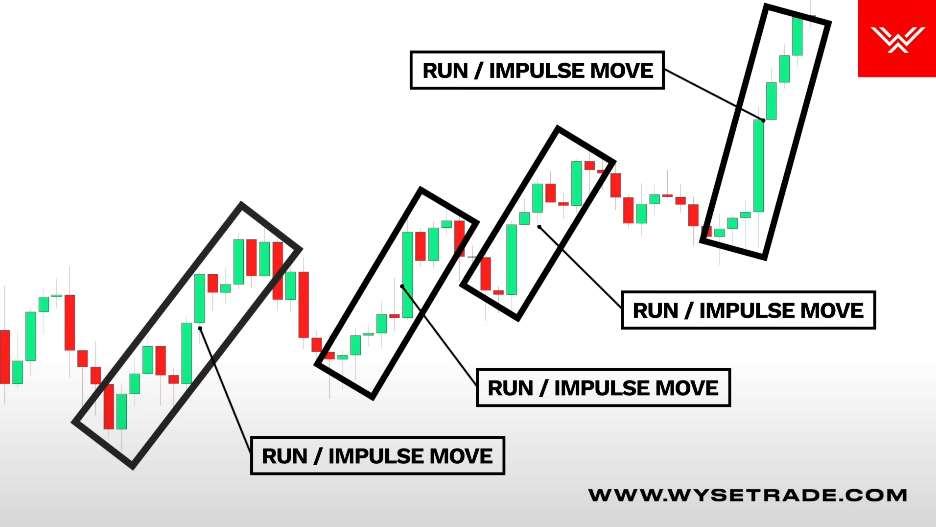
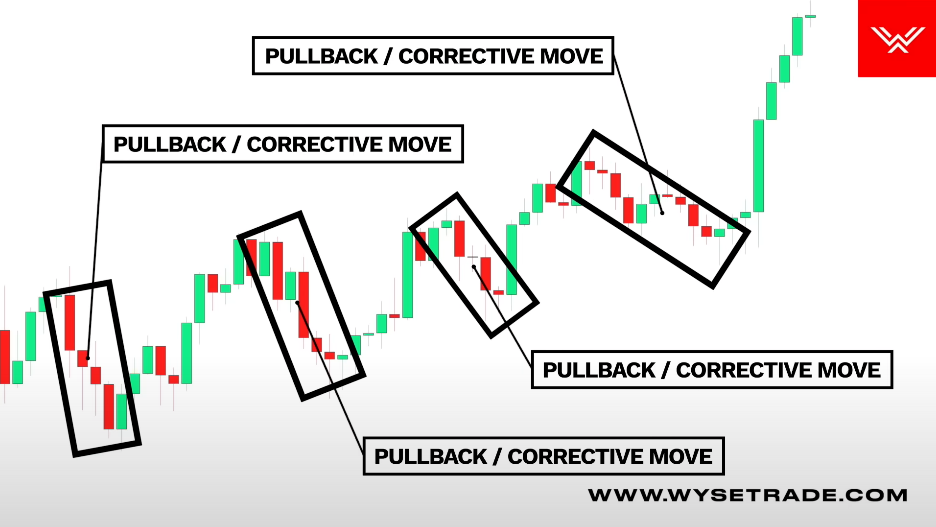
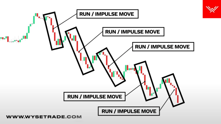
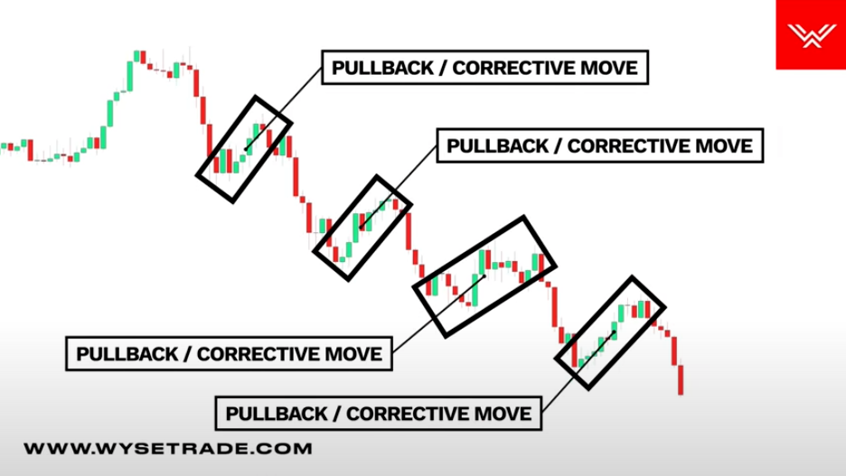
Runs and pullbacks
Run / impulse move
Pullback / corrective move
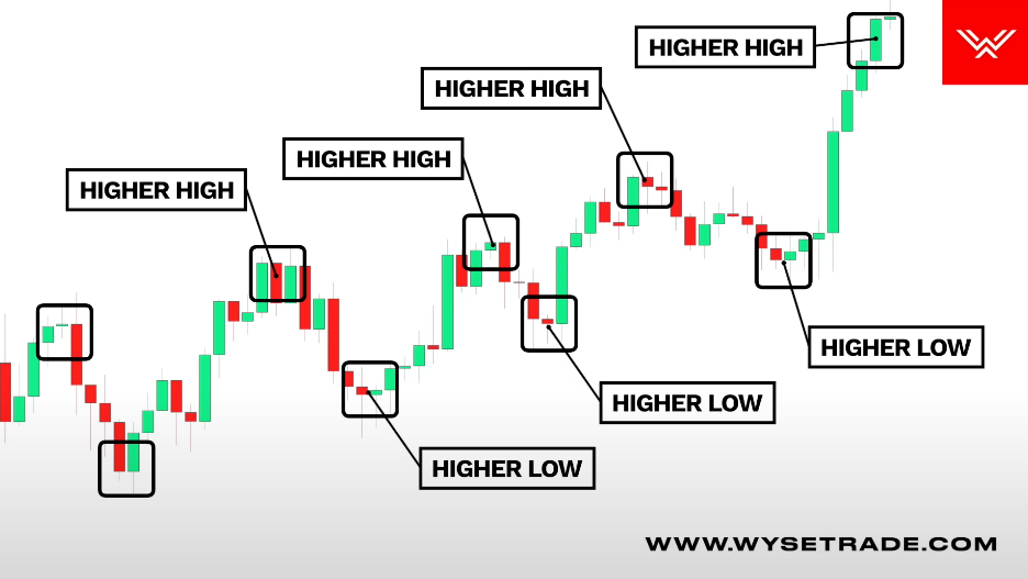
A moving uptrend makes higher highs and higher lows, meaning there is bullishupwards momentum in the market so you want to use that to your advantage and take long trades.
Price action psychology behind uptrends
There is bullish upwards momentum in the market that the buyers are in control. So you lean towards taking long entries to trade with the moving “upwards herd momentum”.
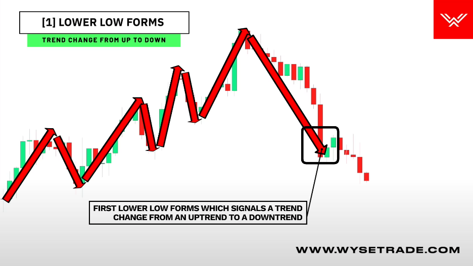
Trend change: Uptrend -> downtrend
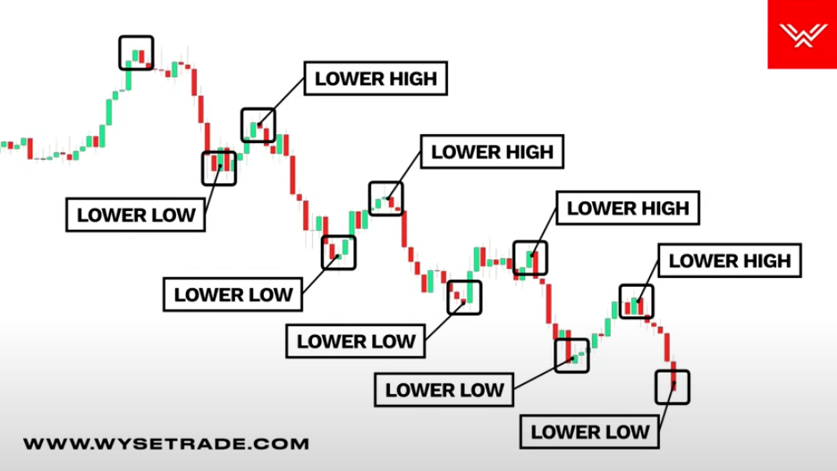
Lower low forms: You have your moving uptrend through the higher highs and higher lows before a lower low (relative to the previous low in the uptrend) forms, signaling a trend change from an uptrend to a downtrend.
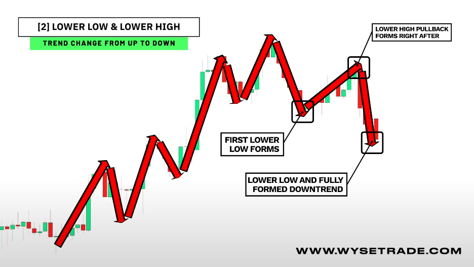
Lower low and lower high: You have your moving uptrend through the higher highs and higher lows before a lower low forms, signaling a trend change from an uptrend to a downtrend.
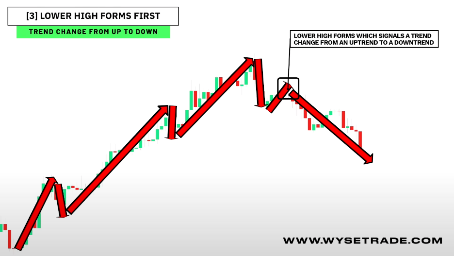
Lower high forms first: You have your uptrend through the higher highs and higher lows before you have a lower high that forms, signaling a trend change from an uptrend to a downtrend.
Certainty
Pattern
Implication
Strategy
Low
Lower High (before any lower low)
Early warning only
Tighten stop-loss, take partial profits, wait for confirmation
Medium
Lower Low (break of higher lows)
Uptrend structure broken
Reduce/exit longs, aggressive traders may try small shorts
High
Lower Low → Lower High → New Lower Low
Full trend reversal confirmed
Exit longs completely, best entry for shorts
Downtrend
Runs and pullbacks
Run / impulse move
Pullback / corrective move
A moving downtrend makes lower highs and lower lows, meaning there is bearishdownwards momentum in the market so you want to use that to your advantage and take short trades.
Price action psychology behind uptrends
A moving downtrend shows bearish momentum and that the sellers are in control. So you lean towards taking short entries to trade with the moving “downwards herd momentum”.
Trend change: downtrend -> uptrend
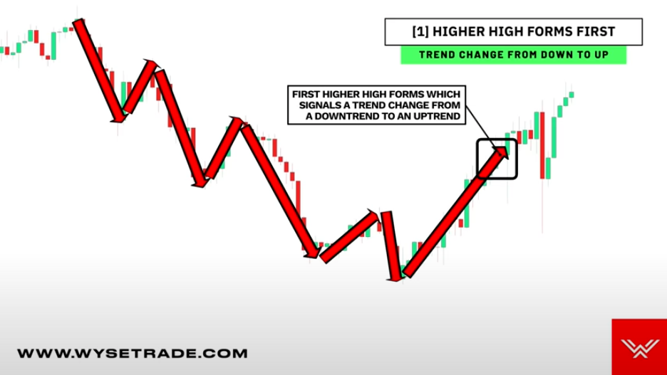
Higher high forms: You have your moving downtrend to the lower highs and lower lows before a higher high forms
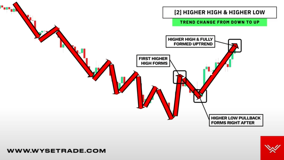
Higher high and higher low: You have your moving downtrend, the lower highs and lower lows before you have a higher high form followed by a higher low pullback before the full trend change breakout and higher high.
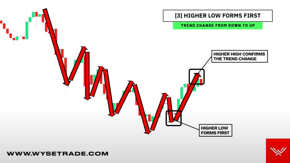
Higher low forms first: You have your moving downtrend through the lower highs and lower lows before you have a higher low that forms first, followed by a trend change breakout and higher high.
Certainty
Pattern
Implication
Strategy
Low
Higher High (before higher low)
Early warning, downtrend may weaken
Wait, tighten stop-loss, maybe small position entry
Medium
Higher Low → Higher High
Trend shifting, partial confirmation
Start partial buy, cautiously build position
High
Higher High → Higher Low → Higher High
Full trend reversal confirmed
Enter long / buy stock, trend confirmed
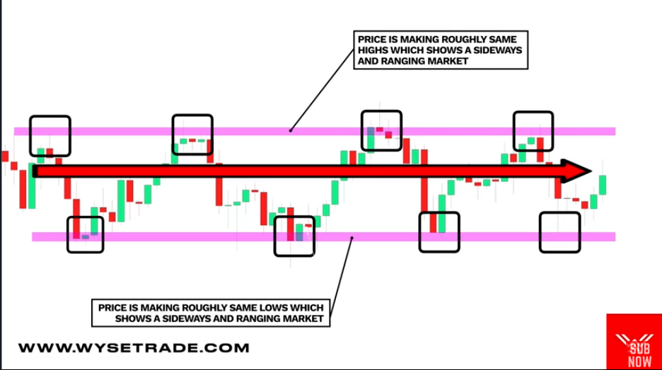
Sideways, ranging market type
Price is making the same highs and same lows and moving in a sideways direction (directionless) -> neither buyers or sellers are in full control
You can trade in both directions, meaning take long & short trades with confidence.
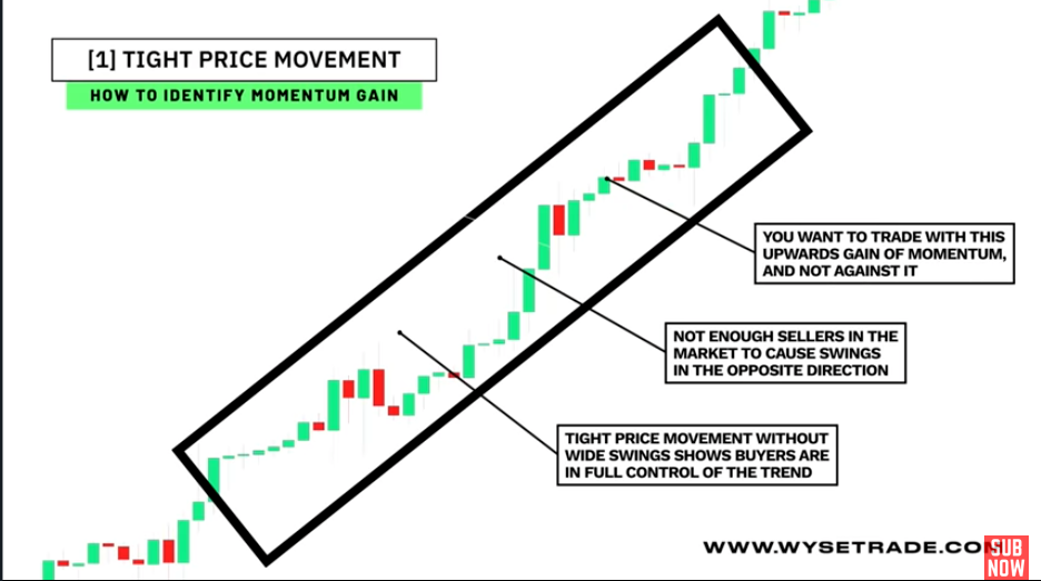
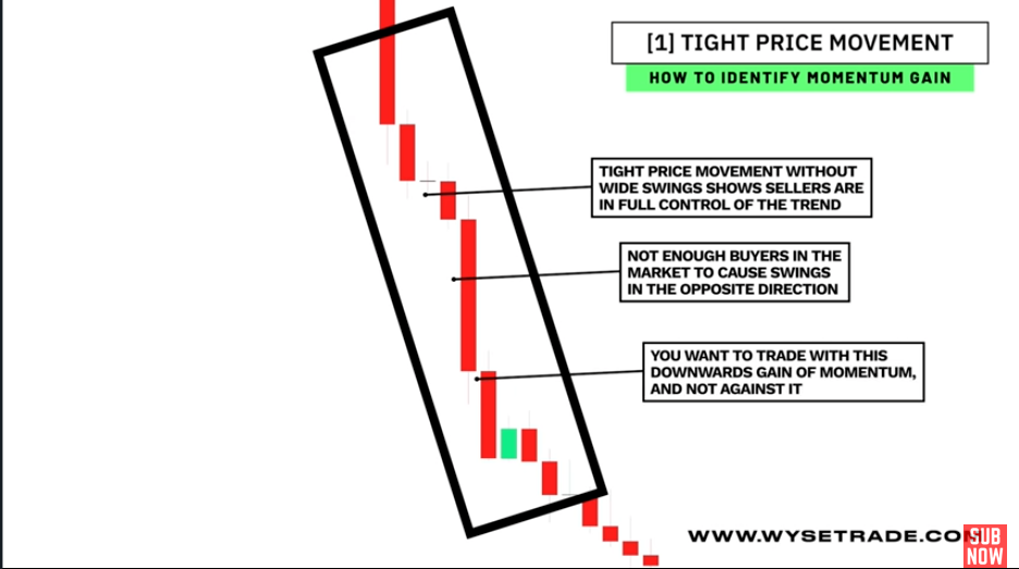
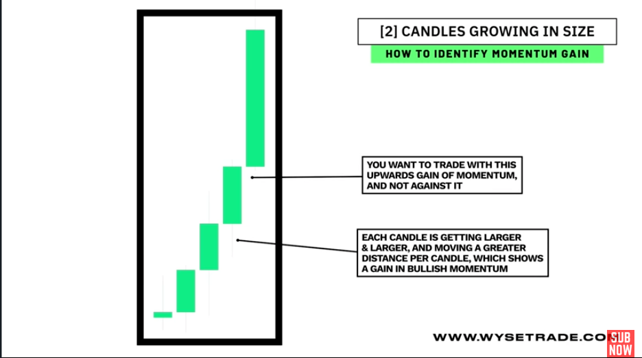
Momentum gain
Look for a moving trend where price is moving very close and tightly together, or look for consecutive candles growing in size.
Momentum Gain
Uptrend
Downtrend
Price is moving very close and tightly together
Consecutive candles growing in size
Tight price movement
In uptrend
It shows buyers are in full control and that not enough sellers are in the market to cause swings in the opposite direction. You want to trade with this upward gain of momentum and NOT against it.
In downtrend
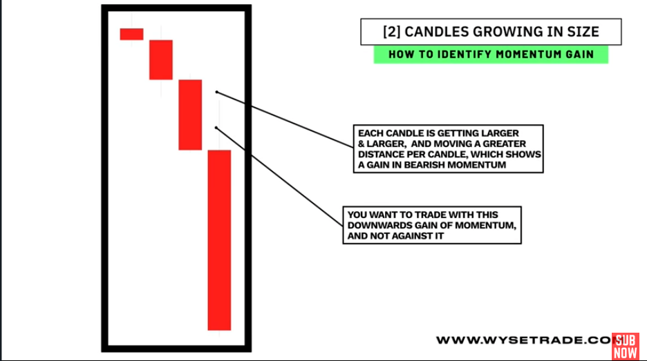
It shows that sellers are in full control, and that there are not enough buyers in the market to cause swings in the opposite direction. You want to trade with this downwards gain of momentum andnot against it.
Candles growing in size
In uptrend
Each candle is getting larger and larger and moving a greater distance per candle, which shows a gain in bullish momentum. You want to trade with this gain of momentum and NOT against it.
In downtrend
Momentum loss
Look for
wide swings of price after tight price movement, or
shrinking candles, or
a candle color change after consecutive cnadles of the same color
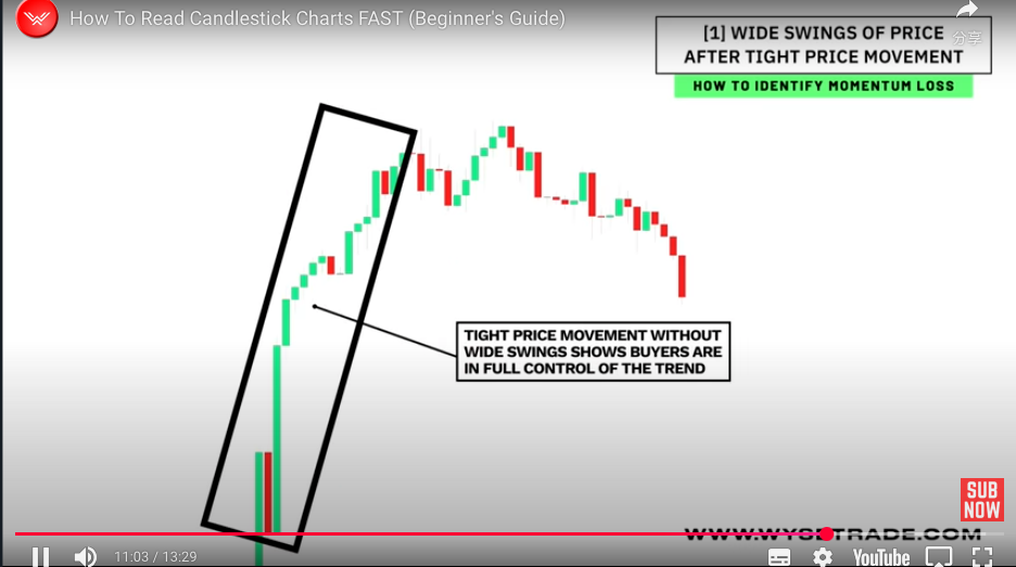
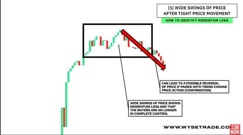
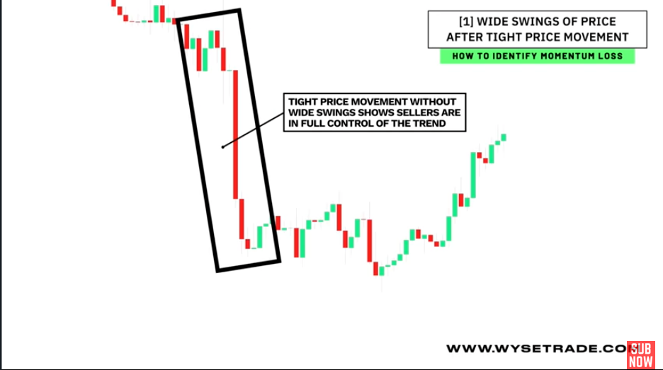
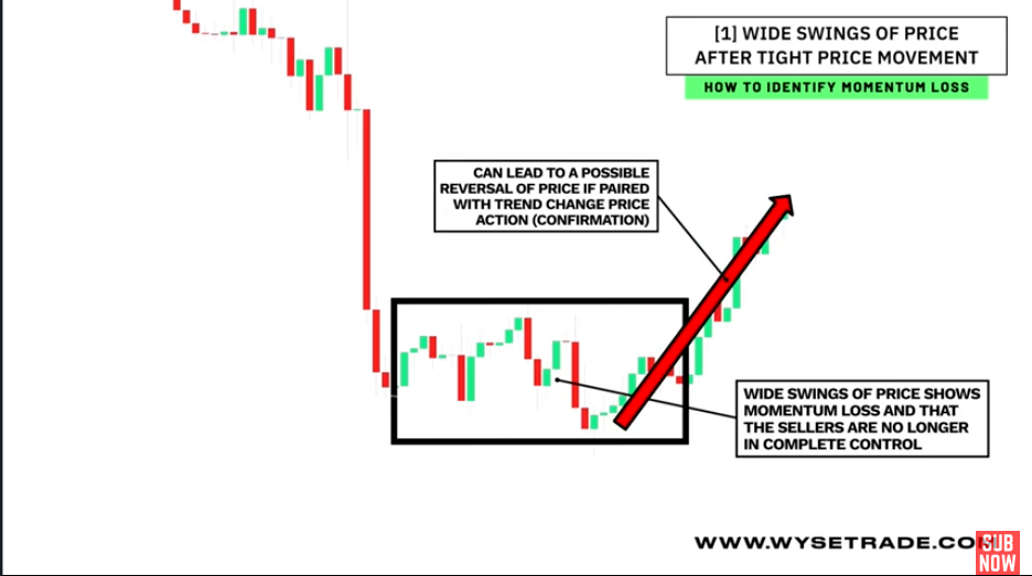
Wide swings of price after tight price movement
In uptrend:
Tight price movement uptrend (buyers are in full control)
Wide swings occurs -> Buyers are no longer in complete control,
It can lead to a possible reversal of price if paired with a trend change, price action going in the opposite direction.
In downtrend:
Tight price movement downtrend (the sellers are in full control)
Wide swings occurs -> Momentum loss, sellers are no longer in complete control,
It can lead to a possible reversal of price if paired with a trend change.
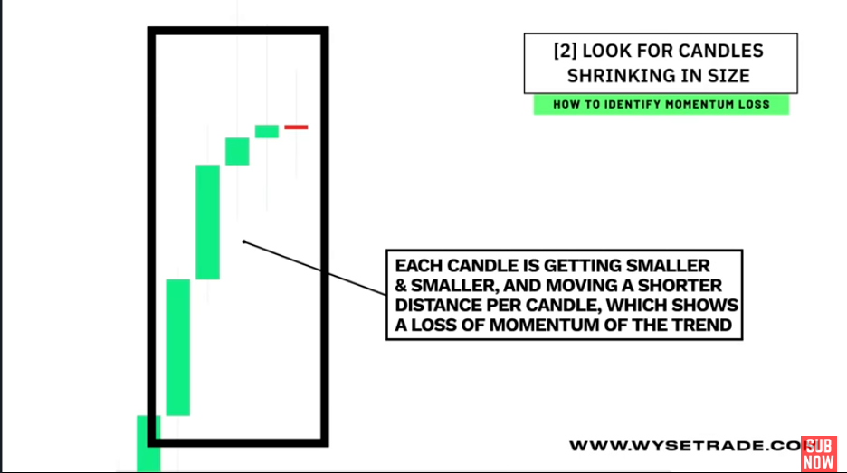
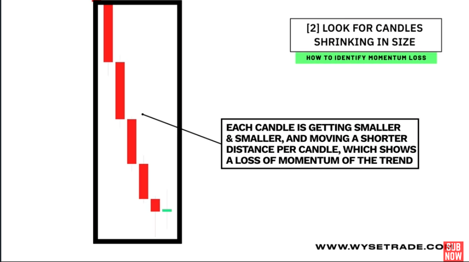
Candles shrinking in size
In uptrend: Start with a big green candle, and then every candle after gets smaller and smaller, which shows a loss of upwards momentum as the distance traveled per candle is less and less.
In downtrend: start with a big red candle, and then every candle after gets smaller and smaller, which shows a loss of downwards momentum as the distance traveled per candle is less and less.
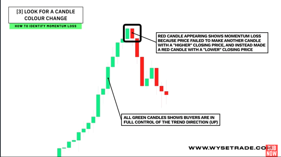
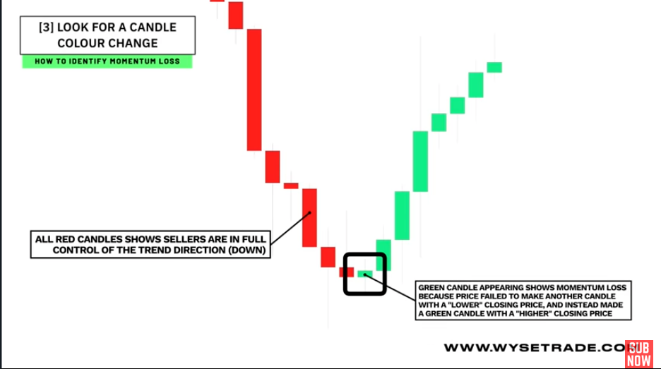
Candle color change
In uptrend:
You have all green candles before a red candle appears.
This shows momentum loss, because price failed to produce another candle with a higher high closing price and instead made a lower closing price through the red candle.
In downtrend:
You have all red candles before a green candle appears.
This shows momentum loss, because price failed to produce another candle with a lower low closing price and instead made a higher closing price through the green candle.
Chart Patterns
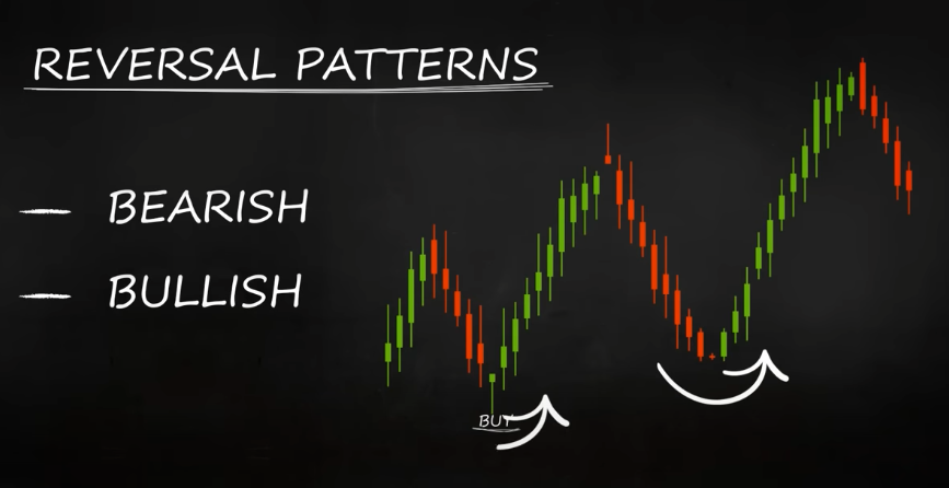
By looking at the patterns that candles create,you can often guess if a certain market is about to continue in its current direction or reverse it.
Patterns that show that the market could change direction are called reversal patterns. They could be
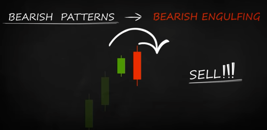
bearish: ones that indicate the change from an uptrend to a downtrend and should be perceived as a signal to SELL
bullish: these show that a price that has been decreasing is likely to start going up and we should BUY
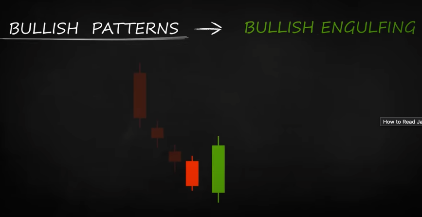
Patterns for Buy 🐮
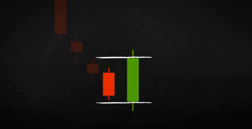
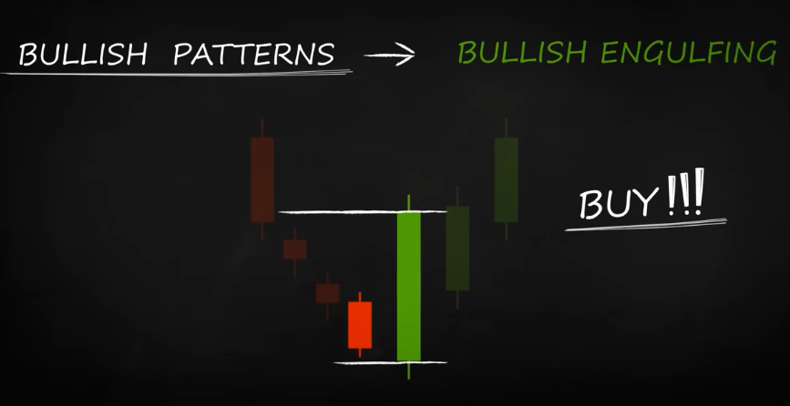
Bullish engulfing
The bullish engulfing consists of a red candle, followed by a bigger green one, which fully engulfs the red candle.
The pattern is an indication of a market turning point - it is likely that the market may start going up ⬆️, and you can BUY. The indication is even stronger if the green candlestick engulfs two or three red candles.
Hammer
Pattern
Short body
Lower shadow: 2 - 3 times the length of the body
Upper shadow: shorter or no shadow at all
The hammer is usually a clear indication of a declining price reversing its direction and starting to go up ⬆️, so you can start BUYing!
But just to be safe, you could always wait for additional confirmation. Such confirmation is a green candle closing above the open of the hammer, for example:
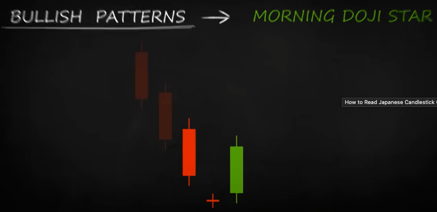
Morning doji star
Appears when there is a slight market movement
It consists of three candles
A red one
Followed by a dojo
Followed by a green candle closing beyond the middle of the first candle
If the green candle is longer than the red one, the signal is even more reliable.
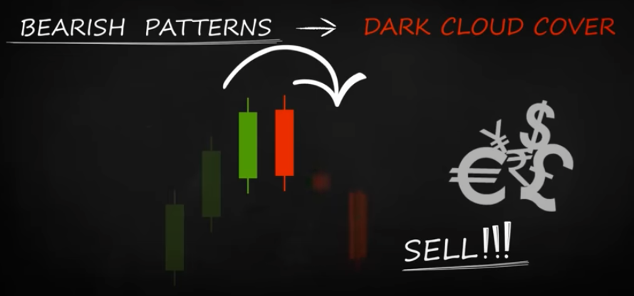
Patterns for Sell 🐻
Bearish engulfing
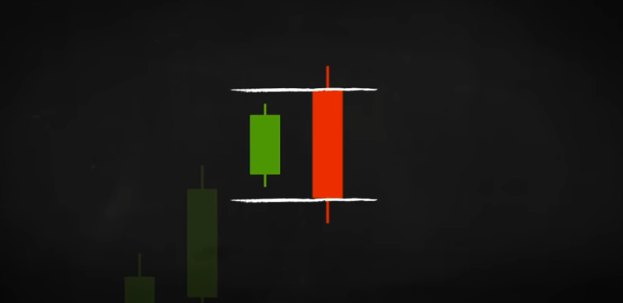
The opposite of bullish engulfing - A green candle is completely engulfed by a following red candle.
When you spot it, you can SELL as the sellers on the market have possibly managed to overpower the buyers, and the price direction could reverse.
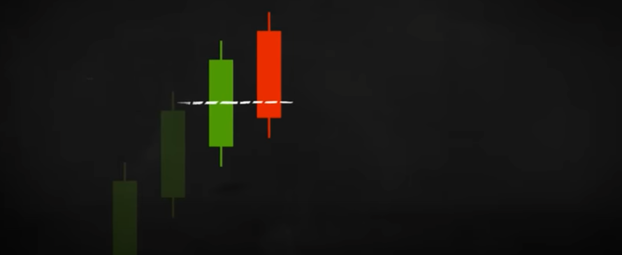
Dark cloud cover
The dark cloud cover appears before the price drops down.
A long green candle is followed by a red one that opens at a new high and closes below the middle of the green candle.
When trading currencies, a second candle opening at a new high is rare, so the red candle usually opens at the close level of the green one. Once you see this pattern, you can go ahead and SELL, or you can wait for another, smaller red candle to form and confirm the dark cloud cover.
Shooting star
A red candlestick with a small body, a long upper shadow, and a short lower one.
When it appears at the end of an uptrend, it shows you that you can SELL, since the price, which has been rising up to that point, may start falling instead.